“Cory guided our research and branding to help us discover who we are and what we need to do next. Her strategy shaped our entire process. People’s Table is a place for all people, and everyone has a seat here. We are deeply grateful to Cory for helping us articulate that.”
Case Study
Rebranding with Purpose: Transforming Jim Luther New Hope Center into People’s Table
The Challenge
The Jim Luther New Hope Center, a food pantry and cooperative program serving Milwaukee’s South Side, had been a trusted lifeline for more than two decades. Yet as its programs and impact grew, its name no longer reflected its mission or the diverse population it served. Many patrons do not speak English and are often brand new to the country or the neighborhood, which made the existing name difficult to find and understand. The enduring legacy of its late founder, Jim Luther, who dedicated his life to the Center, made any change highly sensitive. Leadership needed a name and identity that were clear, welcoming, and accessible, while still honoring its history.
The Solution
Campe + Co. helped lead a research-driven process to uncover the organization’s current realities, challenges, and strengths. We conducted surveys, achieving a response rate of more than 70 percent, supported a board retreat, and collaborated with staff to plan an appreciation dinner that brought together volunteers and supporters. At that dinner, we shared survey data to build buy-in and also conducted additional research to capture more perspectives.
Later, we held a focus group with pantry clients and cooperative members to test language and gather deeper insights. These efforts surfaced a clear need for a new identity that communicated nourishment, belonging, and shared purpose.
The naming process was community-centered and respectful of the strong connection many had with founder Jim Luther. More than 50 names were considered, narrowed to three, and tested in focus groups. Words like “people” and “table” resonated most, ultimately leading to the selection of the new name, People’s Table.
Execution
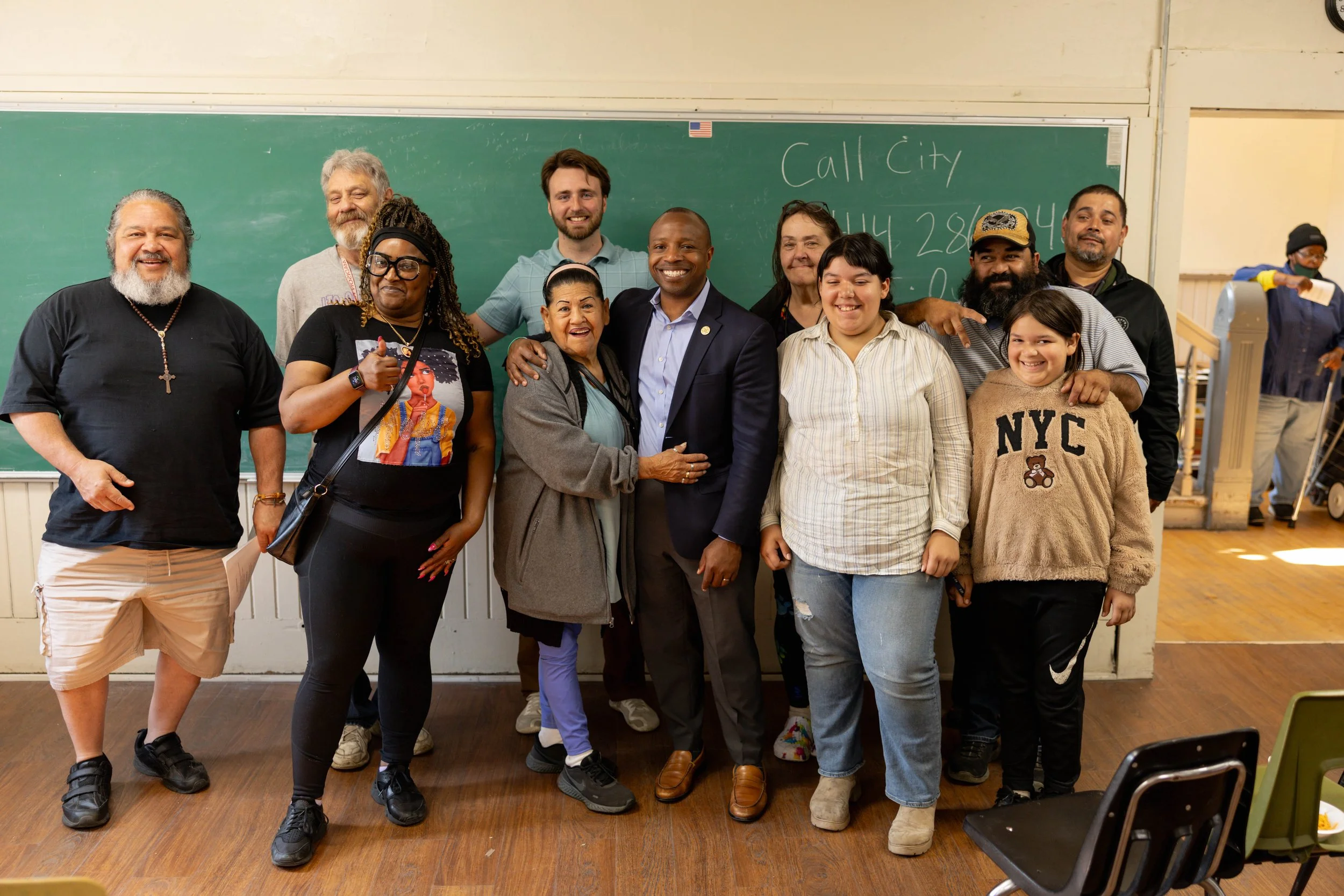
We developed a warm and inclusive brand identity (Creative Director, Daniel Flemming Studio) centered on a woodblock-print inspired logo that symbolizes a welcoming table. A new website was launched, designed to be flexible, scalable, and accessible to a diverse audience with translations in English, Spanish, and Burmese. A pro-bono photo shoot (thank you, Andrew Feller Photography) captured authentic images of clients, volunteers, and even a surprise visit from Milwaukee Mayor Cavalier Johnson.
The new brand was unveiled at a celebratory community event on September 22, which was both well-attended and filled with excitement. City officials, board members, volunteers, cooperative members, and neighbors gathered to witness the unveiling and share in the moment. To ensure stakeholders heard the news first, we kept the new identity under wraps until the big public reveal. A carefully timed press release and earned media outreach followed the event to share the story publicly.
Key Takeaways
The rebrand solved a sensitive and confusing naming challenge by delivering a thoughtful new identity and website that works for everyone in need and in service. People’s Table now has a clear, scalable brand that honors its history while positioning it for the future. The brand and website convey dignity, inclusivity, and hope, strengthening connections with clients, volunteers, donors, and the broader community. Achieving this outcome was only possible through close collaboration with a fantastic marketing committee of staff, board members, and partners. With this renewed clarity and purpose, People’s Table is prepared to grow programs, expand partnerships, and continue serving 6,000 families each year.
Services Provided
Research
Brand Strategy
Naming
Logo and Brand Identity
Website Hosting & Development
Content
SEO Optimization
Community and Public Relations
Event Marketing